I fell in love with DINOT. I think it was Nermin who introduced it to me? I can’t remember. But I loved it the moment I saw it.
It’s a dense, condensed font.
“Named DIN 1451, the font was defined in 1931 and in 1936 became the standard font for german railroads, highway, road signs, and car license plates.”
DINOT has a lot of variations, free to use. None of them are DINOT, though the inspiration is shared with the German Bauhaus style with which it shares it’s roots.


Fonts & images go together for miles, they’re timeless.

And where we get things like this…

To make things like this.

and this.
")
")
Are we talking about fonts?
We talking about practice?
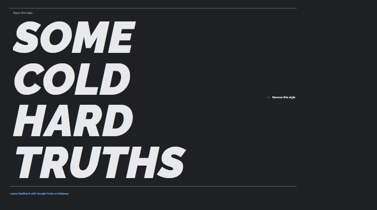
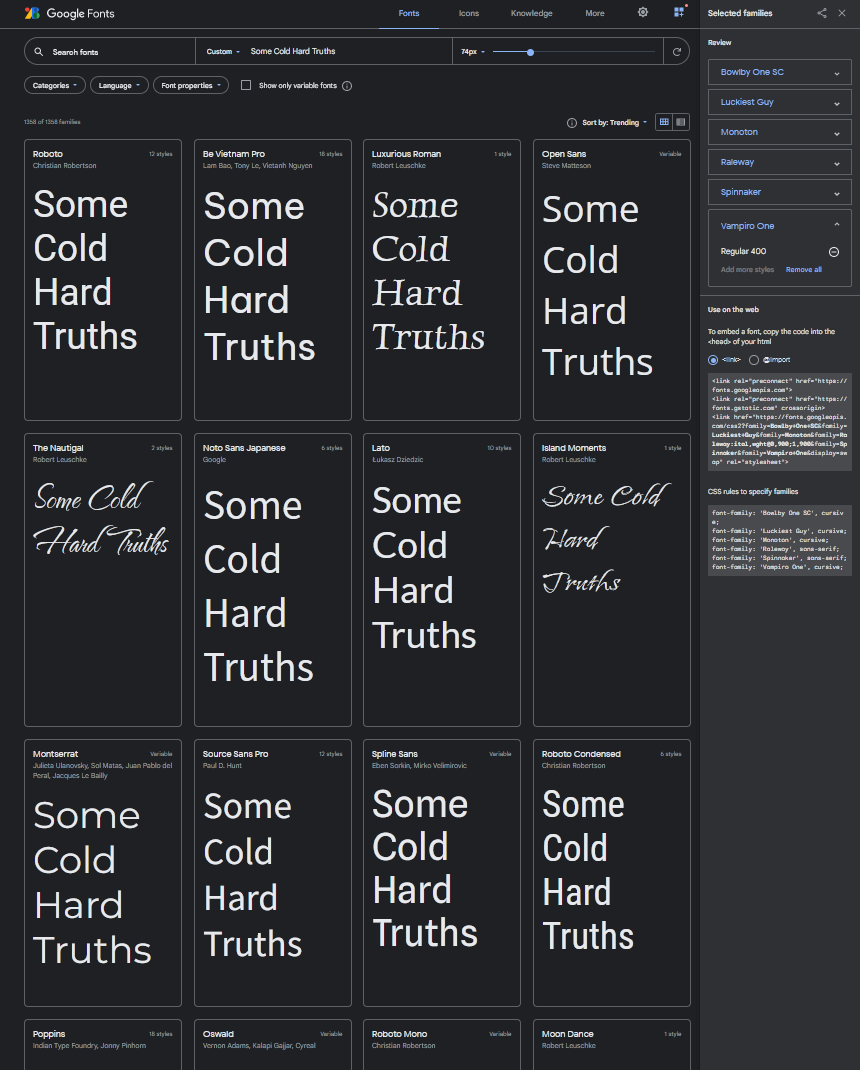
I like the Raleway font.


In fact, it seems I like Raleway so much, I naturally gravitated towards it while browsing through Google Fonts, a great website to browse for open, free fonts.
It’s the same font we use for Parkdale Centre (total coincidence).

Parkdale Centre’s font is a thinner variation, and creates a skewed effect when placed within the rings, like gravity. None of the letters are bent. They just seem to spiral into the middle of the rings. I think that’s neat.
This was a lot of fun to design, and came together pretty quickly. The for still doesn’t sit well. Maybe send it behind one of the rings? We quickly moved on.
I like the Italic, Boldest version of Raleway.
I also like this screenshot from Google Fonts, that it has the blue writing at the bottom, and the other little writing. It feels cool.
In fact! Left-half is the front-cover, and right-half is the right-cover. I’ll obsess over the details later (or not!).
Pride is the Devil
I was working with someone the other day and they told me:
tbh, i always wanted to be a writer, but my Clergyman explained how it corrupts your soul with sin of pride, so i decided to be software developer...
A wise person.
Earlier in the week, I was writing Chapter 7 of SOME COLD HARD TRUTHS to publish here on Substack.
It’s titled TWENTY TWENTY TWO.
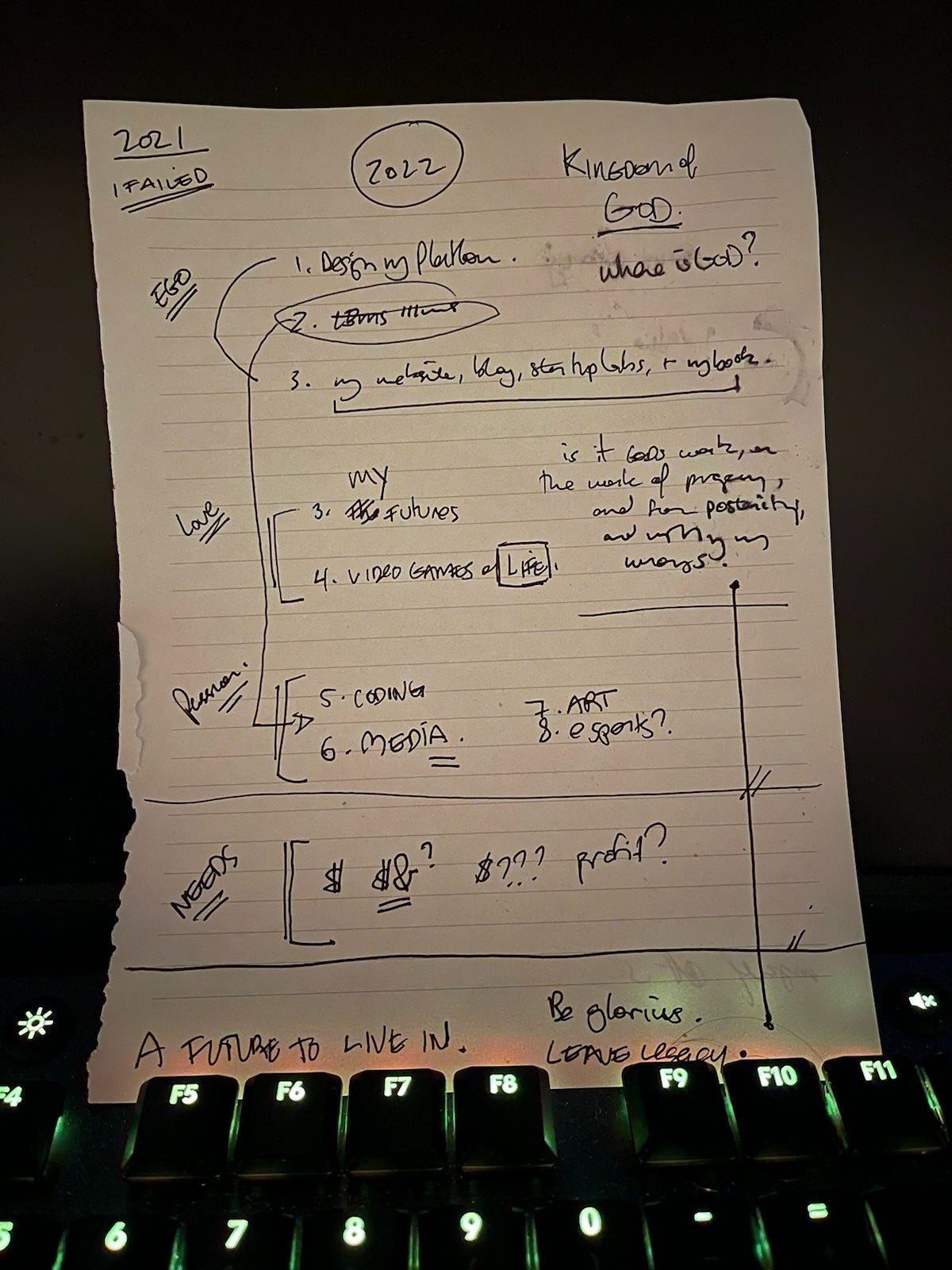
While writing it, I asked myself, who am I writing this for? I’d already written my 2022 on a piece of paper for myself.
I found myself writing for who might read it, and so I stopped right away. Bringing our written journey here to an end, in preparation of publishing the rest of that world inside of SOME COLD HARD TRUTHS.
I am excited to write to help me learn about new things, code up a new website for myself, and stop using 3rd parties to host my content.